


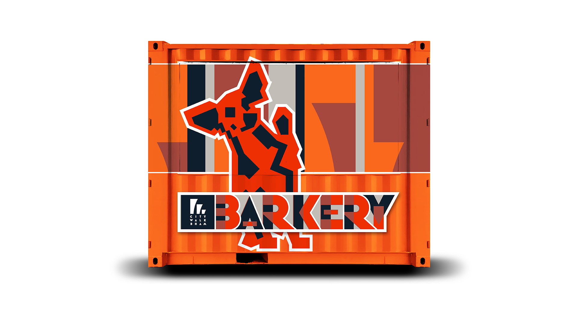
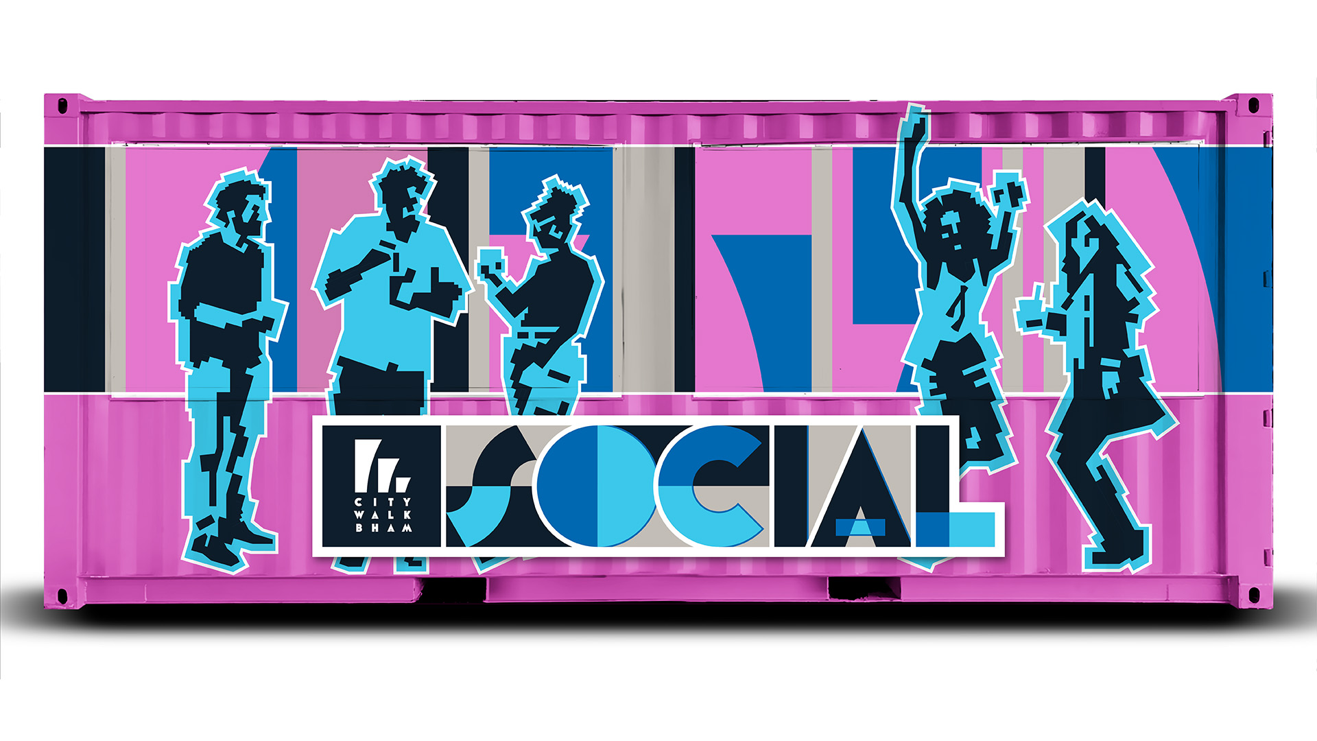
Two historic city blocks in the Parkside district make up one of Birmingham’s newest destinations for food, entertainment and shopping. Urban Supply’s rough-and-tumble warehouses date back to the area’s early rail freight roots. In designing the Urban Supply custom letterforms, I imagined re-assembling sections of track while shaping the diagonals with wide parallels. For secondary wording, I employed the font Lot for its near absence of counters to resemble rivets on a boiler. Delivery of the logo was accompanied by a brand guide specifying usage within a bold, art nouveau color scheme.


 Michael Vizzina Studio