


The star atop Carraway Hospital had long been a beloved symbol above Birmingham. The shuttered medical campus in Uptown will now become a colossal office, retail, entertainment, hotel and residential development. Though this intriguing identity made for Corporate Realty started with naming, logo and brand guide, there’s more design to come for The Star. The name speaks of a bright destination and the logo depicts connection. With this design, I suggest the recognizable silhouettes of Birmingham’s prominent buildings. The star integrates with the skyline using a single continuous line to imply the neighborhood’s cultural connectivity. Like most celestial bodies, The Star is best seen as a beacon in the night sky. While I specify a flat version of the logo when backed by color, this version is only presented on black and uses what I call Starlight Blue in gradients and glows to mimic the appearance of neon and backlit signage.


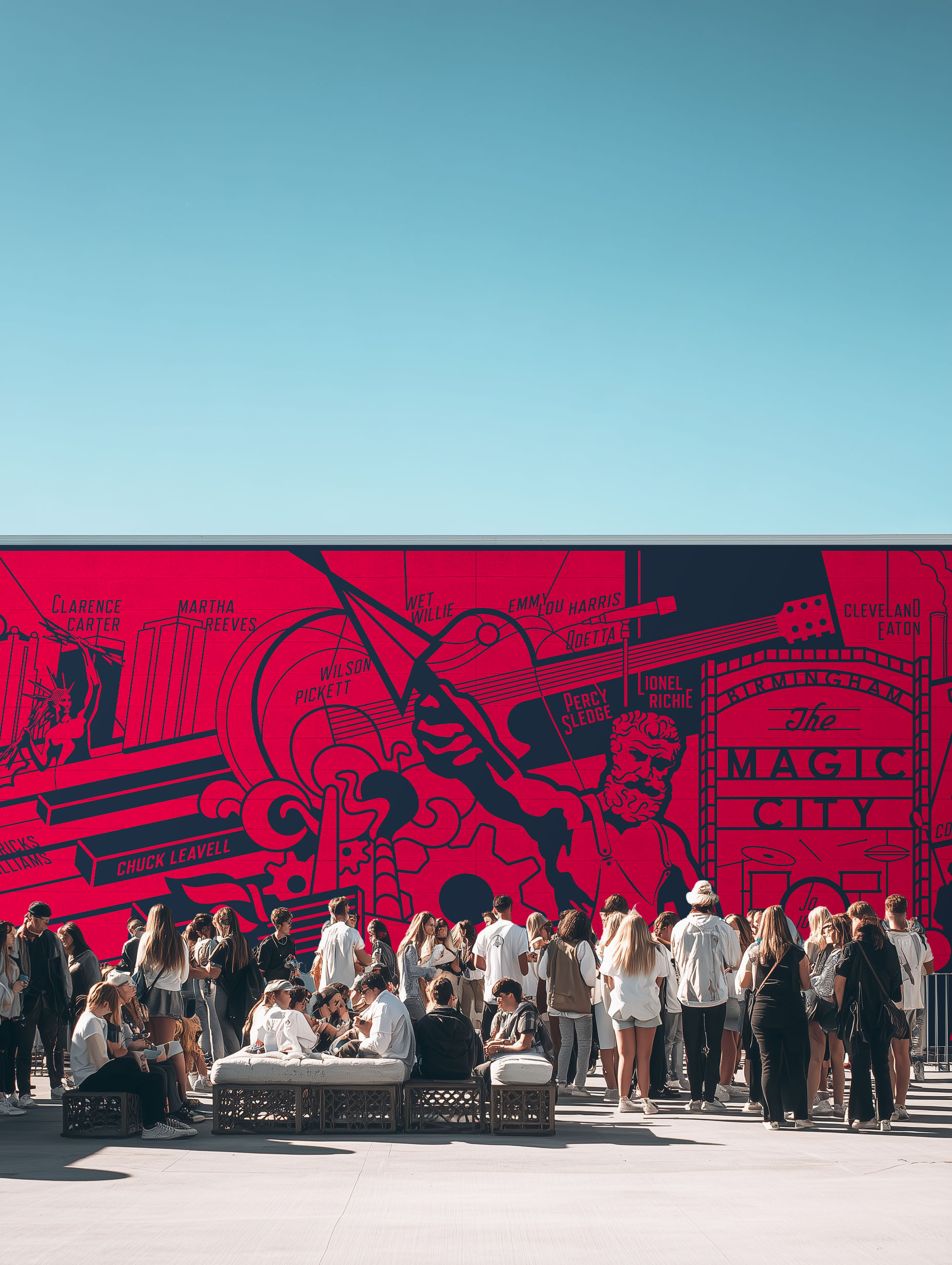


 Michael Vizzina Studio