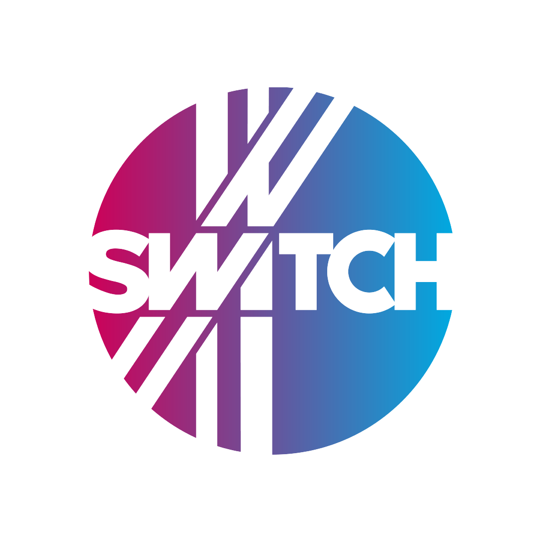
The Switch is an “Innovation District” that’s home to some of Birmingham’s most exceptional companies and entrepreneurial people. In the last century, this part of downtown contained one of Birmingham’s largest switchyards. A massive corridor of railroad tracks weaved and cut the landscape into irregular shaped city blocks and buildings. This robust history informed the project’s naming and branding efforts. With this logo, I’ve altered bold letterforms to complement the shape of intersecting tracks closely contained within the boundaries of a wheel. When used as a separate supporting design element, the tracks imply their endless reach. To reinforce the concept of a defined space, this logo is inverted upon a straightforward palette of cyan and magenta.















 Michael Vizzina Studio